Are Fancy Fonts Accessible? What to Know Before You Use Them
Not reliably. Fancy fonts are special Unicode characters, not real fonts, so screen readers may skip them or read them oddly, and older devices may show empty boxes. Use them for decoration and keep anything important in plain text.
- Fancy text is made of Unicode characters that look styled, not of fonts
- Screen readers may skip it, spell it out, or read it inconsistently
- Fine for: a styled name or a short tagline next to plain text
- Avoid for: contact details, links, forms and long paragraphs
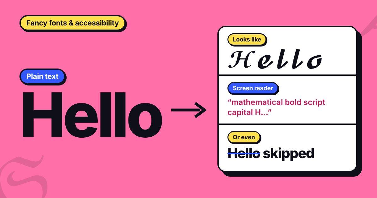
Picture a bio that reads 𝓗𝓮𝓵𝓵𝓸, 𝓘'𝓶 𝓜𝓪𝓻𝓲𝓪. To most people it looks like handwriting. To someone using a screen reader, it might be skipped entirely, or it might come out as a string of technical character names. Fancy text is fun, but it is worth knowing what it does for readers who don't see the page the way you do.
What Is Fancy Text, Really?
Fancy text is not a font. A generator swaps each letter you type for a different Unicode character that happens to look styled, such as bold script or double-struck. Because these are real characters, they paste into Instagram, WhatsApp and Discord without an app or a download.
To a computer, though, 𝓜 is not the letter M. It is a separate character with its own name. That one fact explains most of the problems below. For the full mechanics, see our guide to how a name font generator works.
Here is what that looks like in practice. The five letters in 𝓜𝓪𝓻𝓲𝓪 are U+1D4DC, U+1D4EA, U+1D4FB, U+1D4F2 and U+1D4EA, and each has an official name, such as "Mathematical Bold Script Capital M". They come from a block of Unicode created for mathematics, where a styled letter can stand for a particular kind of variable in an equation. The Unicode Standard says these characters are meant for mathematical and technical notation and should not be used to style ordinary text (see section 22.2.2 of the Standard). Nothing stops you from pasting them into a bio, and generators do exactly that, but they are being used for something they were not designed for.
What Does a Screen Reader Say When It Meets Fancy Text?
A screen reader speaks what is on the page, or sends it to a braille display. Ordinary letters are easy for it. A styled character forces it to decide whether the symbol is a letter, a math symbol or something to skip, and published demonstrations show different outcomes. Designer Per Axbom shows a screen reader going silent on styled words, and says others may read out a long description of every character instead. The UK disability charity Scope gives a similar example, where a single styled word takes far longer to hear than the plain version.
Take 𝓜𝓪𝓻𝓲𝓪 again. If a reader announces each character by its Unicode name, it says "Mathematical Bold Script Capital M", then "Mathematical Bold Script Small A", and so on. That is about 25 words to say one five-letter name, and the listener has to put the letters back together.
Which behavior you get depends on the tool. WebAIM's Screen Reader User Survey #11, run in July and August 2026 with 1,780 valid responses, shows how many different screen readers are in everyday use. The shares add up to more than 100% because many people use more than one.
| Screen reader | Where it runs | Respondents who use it commonly |
|---|---|---|
| JAWS | Desktop (Windows) | 69.2% |
| NVDA | Desktop (Windows) | 59.3% |
| VoiceOver | Desktop (Mac) | 42.0% |
| VoiceOver | Mobile (iPhone and iPad) | 72.2% |
| TalkBack | Mobile (Android) | 29.5% |
With that many tools, each with its own settings, there is no single answer to how your text will sound. Most published tests of fancy text are demonstrations rather than controlled studies, and we haven't tested every screen reader ourselves, so treat this as a risk to plan around and not as an exact rule. Our name font guide makes the same point in its section on where name fonts fall short.
What About Underlines, Strikethrough and Symbols?
Underline and strikethrough styles work differently. A generator adds an invisible combining character after each letter, so the letters underneath stay ordinary, which makes them gentler on meaning than script or bold. The catch is the extra marks: the word hello with an underline after every letter is 10 characters, and a search for plain hello will not match it exactly.
Decorative symbols such as ✦ and ★ have official names (Black Four Pointed Star, Black Star), so a screen reader may read them aloud. Keep them to one or two.
Who Else Is Affected?
Screen reader users are the group people mention first, but Scope's guidance says fancy characters can also cause trouble for people with dyslexia, low vision or learning difficulties, and for people reading in a second language.
- People who rely on larger text or a more readable font can change those settings for real text. They usually can't make script or blackletter characters any plainer.
- People using translation or read-aloud tools may find styled words skipped, left as they are or read letter by letter, because those tools expect ordinary letters.
- People on older phones or apps may see empty boxes or question marks where the styled letters should be, as Axbom also notes.
The W3C's Web Content Accessibility Guidelines (WCAG) are organized around four ideas: content should be perceivable, operable, understandable and robust. Styled text puts the first, third and fourth at risk whenever it carries your message.
Can Fancy Text Hurt Your Search Visibility?
It can. Axbom points out that search engines may not find text written this way when someone searches in ordinary letters, because the styled characters are different from the ones on a keyboard.
There is a nuance. Unicode defines a process called compatibility normalization (NFKC) that folds styled letters back into plain ones. Running 𝓗𝓮𝓵𝓵𝓸 through it gives Hello, and the same happens with bold, Fraktur and sans-serif styles. Software that applies this step can recover the plain text, but nothing guarantees that a given search engine, platform or filter does.
Length is a quieter issue. These letters sit outside the basic range of Unicode, so each one takes four bytes in UTF-8 where a plain letter takes one, and two units in UTF-16. 𝓜𝓪𝓻𝓲𝓪 is five characters but twenty bytes. A system that counts bytes or code units instead of visible characters may treat a styled bio as longer than it looks.
The simple fix is to keep your name, brand and key search words in plain text, and to style only what you can afford to lose.
Where Is Fancy Text Okay to Use?
Instagram, TikTok, Discord, WhatsApp and X all accept pasted Unicode, so styled text will show on most up-to-date phones. That tells you how it looks, not how it is read or found. A useful test: would anyone be worse off if the text disappeared?
- OkayA display name or nickname, as long as your plain-text username or handle sits next to it.
- OkayOne short tagline or decorative line, with the same idea written in plain text nearby.
- CarefulA whole bio or a long caption. It takes much longer to hear and is harder on the eyes.
- AvoidContact details, links, email addresses and phone numbers. People need to read, copy and click these.
- AvoidForms, usernames, passwords and anything a person has to type back or hand to a machine.
What to Use Instead of Fancy Text
Axbom argues that the real fix is for platforms to support proper rich text, so nobody has to borrow math symbols to get bold or italic. Until that happens, you have a few better options.
- On a website or in a design file, use a real font. The letters stay letters, so screen readers, search and translation keep working.
- Where the platform offers its own bold or italic, use that.
- Inside an image, such as a logo or banner, add alt text that gives the words in plain letters.
- In a text-only field, use fancy text sparingly and keep a plain version beside it. Our text decorator is a good place to try effects with that in mind.
How to Use Fancy Text Without Losing Readers
- Style a name or one short tagline, not the part of your message people need to understand.
- Keep a plain version beside it, such as your handle, your name field or the next line of your bio.
- Skip it for contact details, links and forms.
- Look at it on your phone before you post, in the app you are posting to.
- Listen to it once. Turn on VoiceOver on an iPhone or TalkBack on an Android phone, move over your bio, and hear what a screen reader user would hear. If it is confusing, simplify it.
Want to see how a single letter looks in dozens of styles? Try our Letter A fonts and Letter S fonts pages, or turn any word into 250+ styles with the fancy fonts generator. For digits, there is a number font generator too.
FAQs
Are fancy fonts accessible?
Not reliably. Fancy fonts are Unicode characters, not real fonts, and screen readers may skip them, read them one character at a time, or read them oddly. Results vary by screen reader and device, so use them for decoration and keep key information in plain text.
Do screen readers read fancy text?
Sometimes, but not dependably. A screen reader may announce each styled character by its technical Unicode name, skip it, or read it inconsistently. Because behavior varies between tools and devices, there is no guarantee how a particular reader will hear your text.
Is it okay to use fancy fonts in my Instagram bio?
For a name or one short tagline, usually yes. Avoid it for contact details, links, or anything a reader must understand. Keep the meaning of your bio in plain text and use the styled text as decoration only.
Can fancy text hurt how people find me in search?
It can. Search tools may not treat styled characters as the same letters you would type normally, so a name or keyword written in a styled style may not match a plain-text search. Keep important words in plain text.
Is fancy text what Unicode was designed for?
No. The Unicode Standard says the mathematical alphanumeric symbols behind most fancy text generators are meant for mathematical and technical notation, and should not be used to style ordinary text. They display in most apps, which is why generators use them, but screen readers and search may not handle them well.
Which screen readers do people actually use?
In WebAIM's 2026 survey of 1,780 screen reader users, JAWS (69.2%), NVDA (59.3%) and VoiceOver (42.0%) were the most commonly used on desktop, and VoiceOver (72.2%) and TalkBack (29.5%) on mobile. Many people use more than one, so test with whichever you can and expect differences.
Final Thoughts
Fancy fonts are accessible only in a limited sense: they work everywhere because they are plain characters, but that same fact means assistive tools may not read them well. Use them as a finishing touch on a name or tagline, keep the real message in plain text, and you get the fun without shutting anyone out.